
Brand Marks in Plasticine
Various clients + self-initiated works
A collection of logo interpretations exploring what happens when a brand mark leaves the screen and becomes a physical, hand-sculpted object.
Some of these works were commissioned; others began as self-initiated experiments. The question behind all of them was the same: how can a logo become more human, tactile and emotionally engaging when sculpted by hand in plasticine / modelling clay?
Effie Award
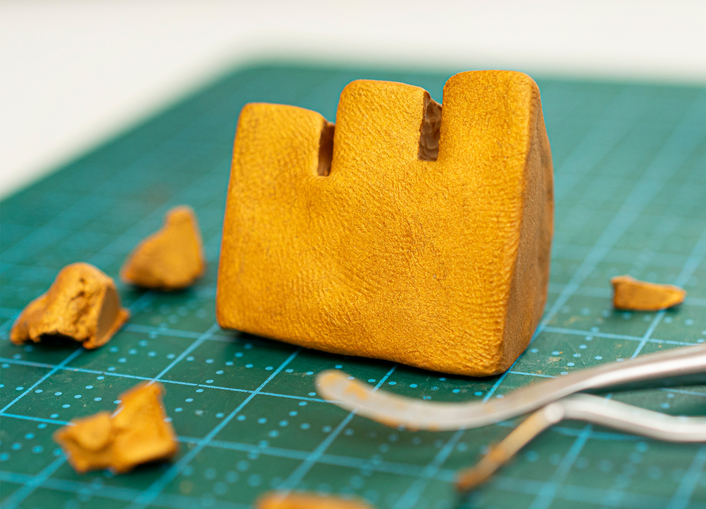
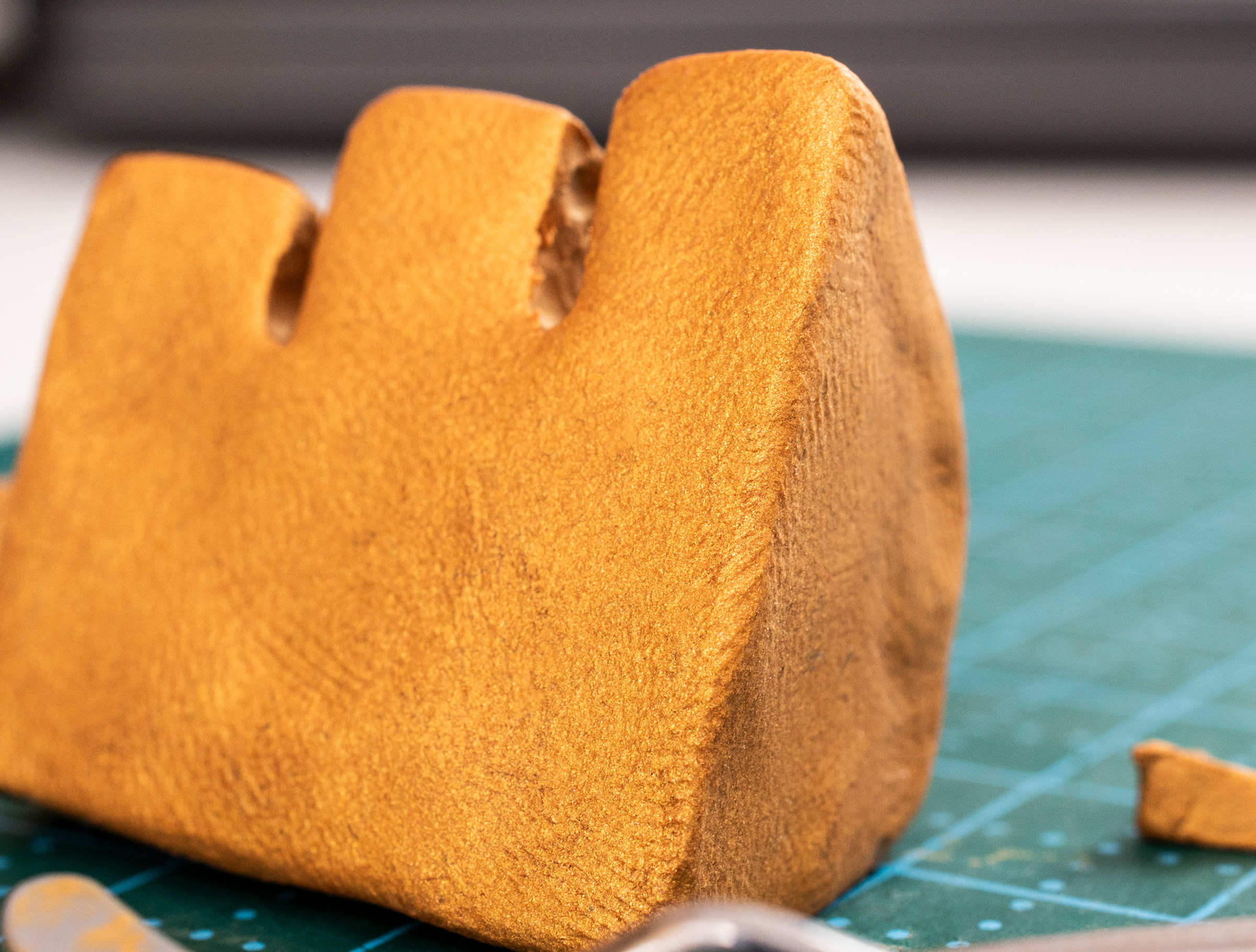
Challenge: One colour, but gold
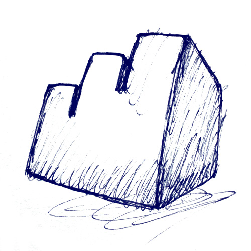
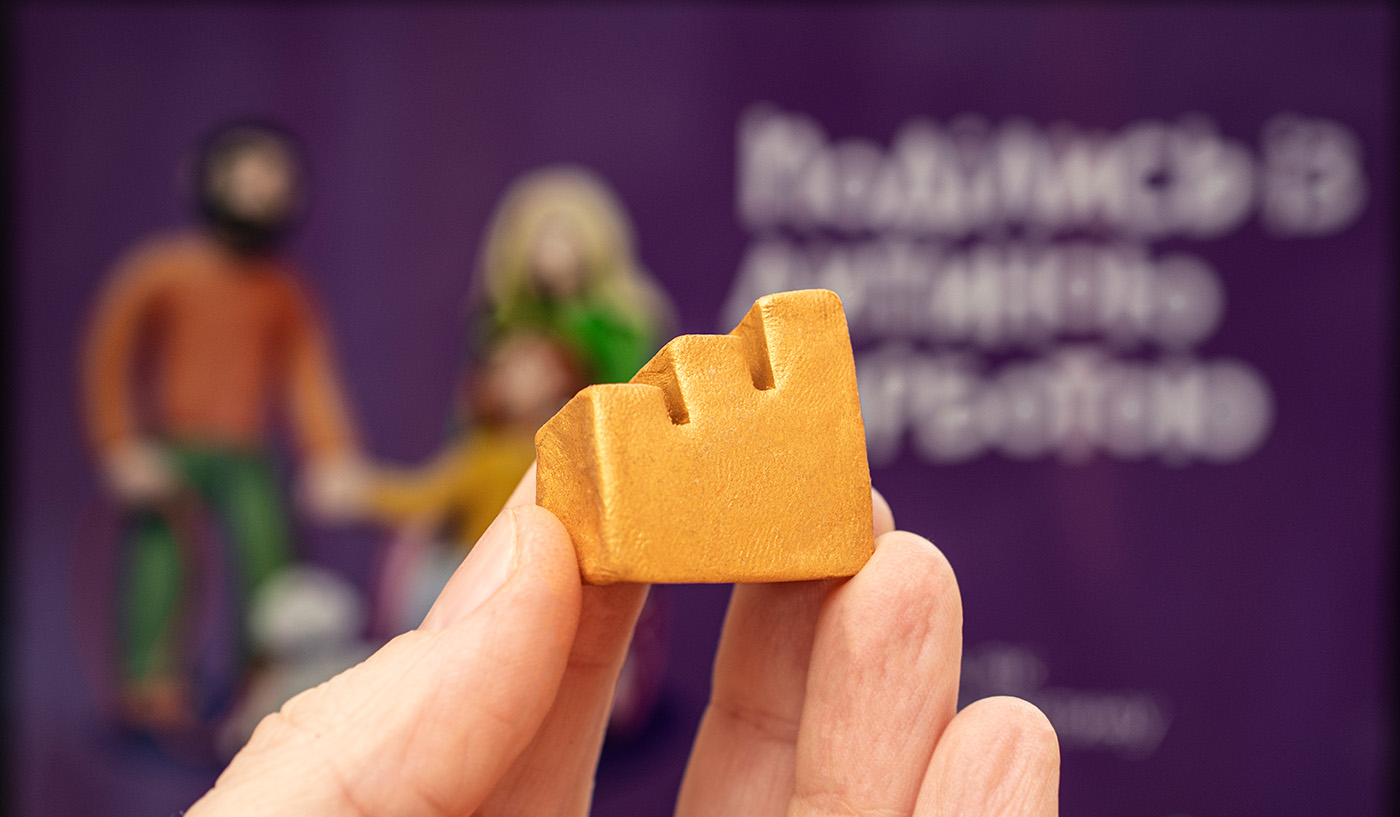
One of the projects I created key visuals for — Shaping Better Care for UNICEF, commissioned by Postmen — received an Effie Award. I decided to make a small clay version of the Effie statuette to celebrate.
The sculpture was only a few centimetres tall, so the proportions and silhouette had to stay faithful to the original Effie statuette while working at a very small scale.
The gold you see in the photograph is real gold-coloured plasticine — no golden effect was added in retouching.
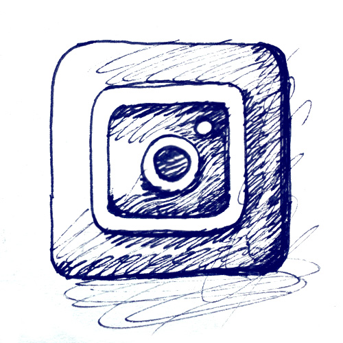
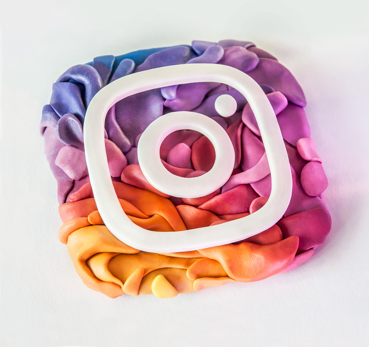
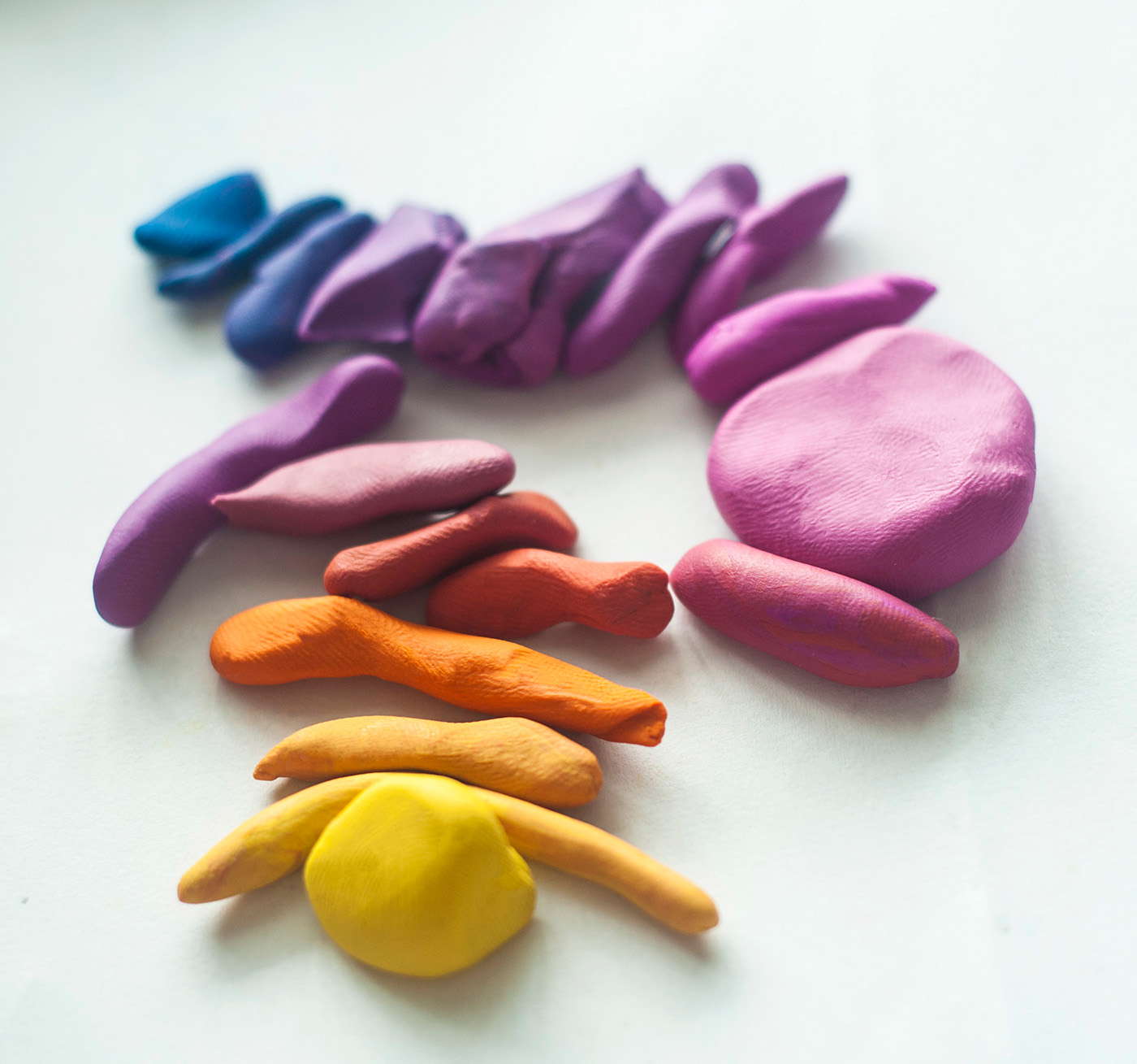
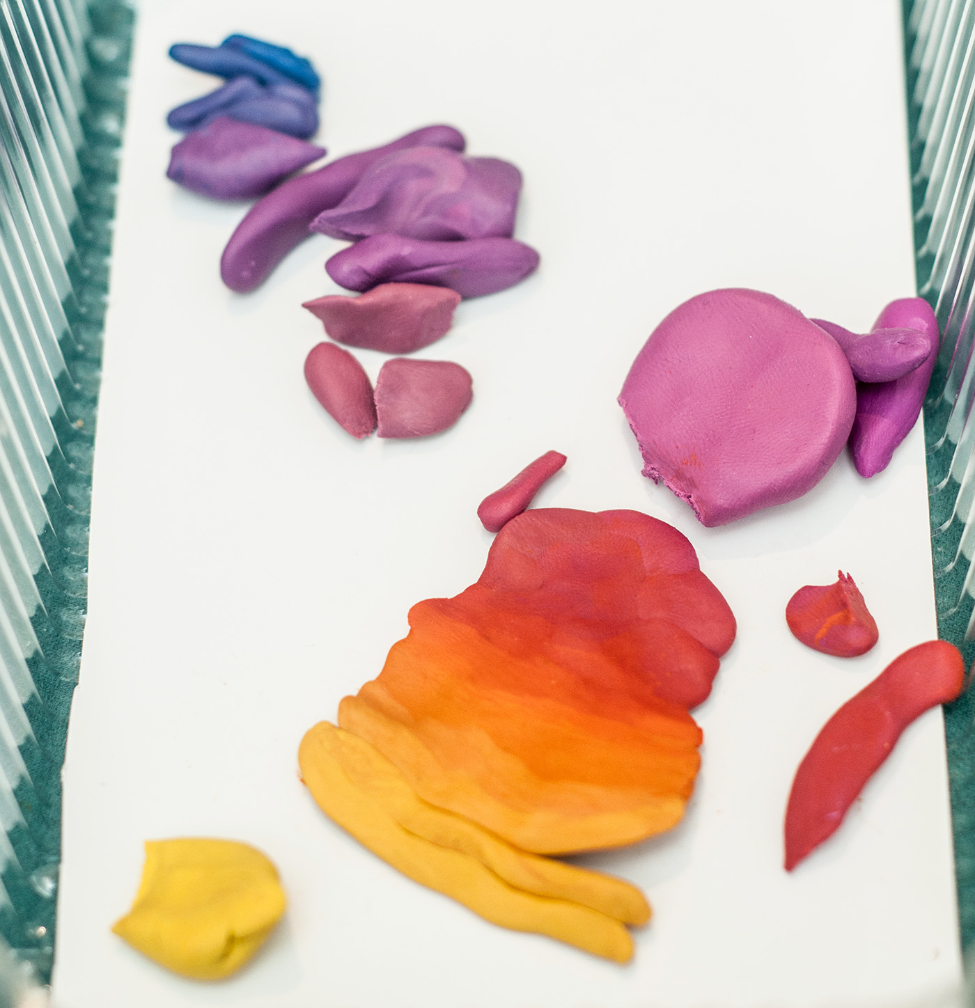
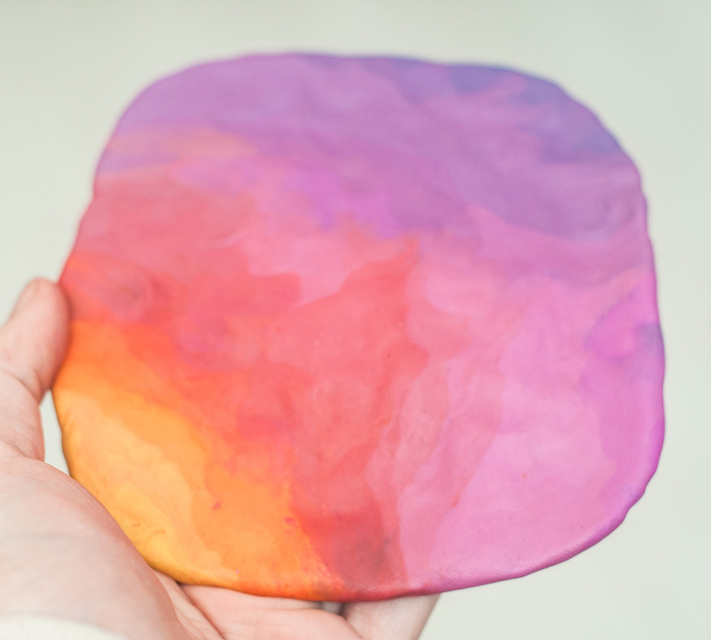
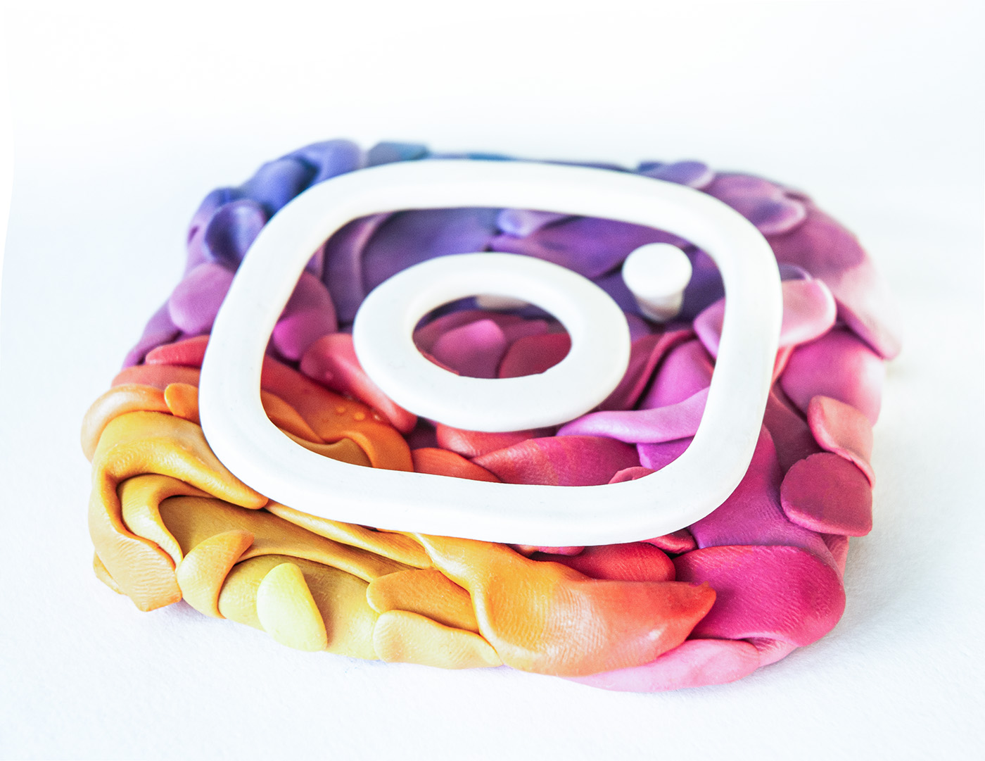
Challenge: How do you build a gradient as a physical object?
A self-initiated experiment exploring how a gradient could exist in clay.
Could a large gradient be built from individual elements, each containing its own gradient? And how far could this idea be pushed while keeping the logo visually coherent?
I wanted every element to have real volume, with the white section physically raised above the lower layer. Creating the gradient while preserving this relief became the main technical challenge.
This work was not commissioned by Instagram or Meta.
the AOI
Challenge: Soft material, precise typography
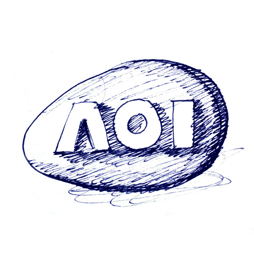
I created this interpretation of the Association of Illustrators logo after they interviewed me about my journey into craft illustration.
I wanted to explore the contrast between soft, delicate marble-like marks in clay and the precise outlines of the letters. The challenge was creating sharply defined letterforms that would contrast with the appearance of a soft, almost stone-like surface. The final precision of the letters was achieved through careful retouching.
The AOI has been a major source of inspiration for me through its work educating illustrators, representing the profession, researching the industry and promoting illustration. I was very happy to create this interpretation as a personal tribute.
macPaw
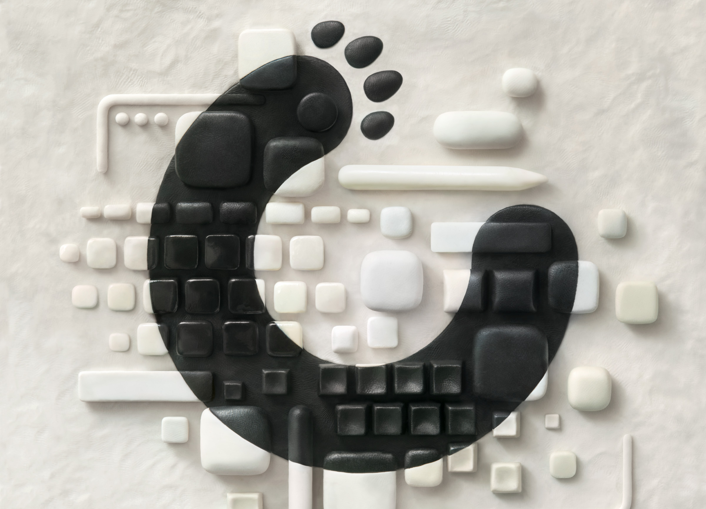
Challenge: How many kinds of clay can one logo contain?
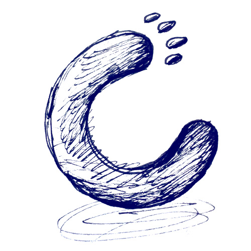
This logo variation was commissioned by macPaw and became one of the most technically demanding pieces of my career.
The idea was to create a visual metaphor for humanity and dedication to meticulous, attentive work. We looked to the collection of vintage Mac hardware at the macPaw Museum for inspiration, exploring its variety of buttons, surfaces and textures.
The creative director and author of the idea was Oleksandr Ageyev, with designer Olia Vtorenko also involved in the project.
We experimented extensively with clays from different manufacturers, each with its own visual, physical and chemical properties. Some surfaces were also varnished. Photography presented another challenge. Capturing the entire sculpture in a single frame would have caused visible shifts and distortions, so the final image was assembled from dozens of individual photographs.
I am a long-time fan of macPaw, so creating this work for the company's anniversary was a particular honour.

test image
Adobe
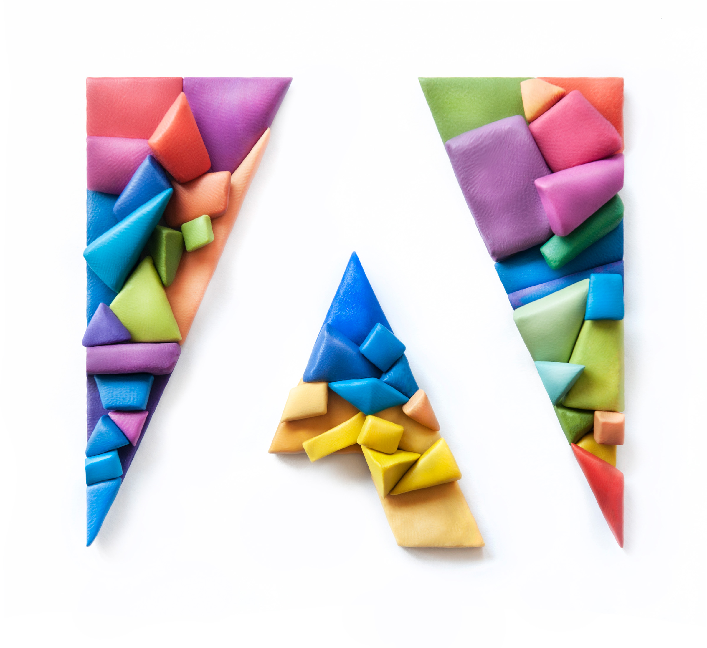
Challenge: Can a brand logo carry the colours of a country?
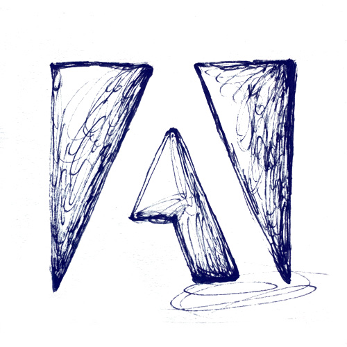
I created this interpretation as a personal gesture of gratitude to Adobe for its exceptional support of Ukrainian creatives following Russia's full-scale invasion of Ukraine.
Adobe's logo is already strongly associated with colour, so I wanted to explore what would happen if its familiar palette was combined with the blue and yellow of the Ukrainian flag.
The question was also an ethical one. We are familiar with many multicolour interpretations of the Adobe logo, but incorporating the colours of a particular country changes its meaning.
I decided to take that risk as a way of expressing gratitude for Adobe's support, including a grant programme that helped many creatives.
Postmen
Challenge: Making precise letter shapes
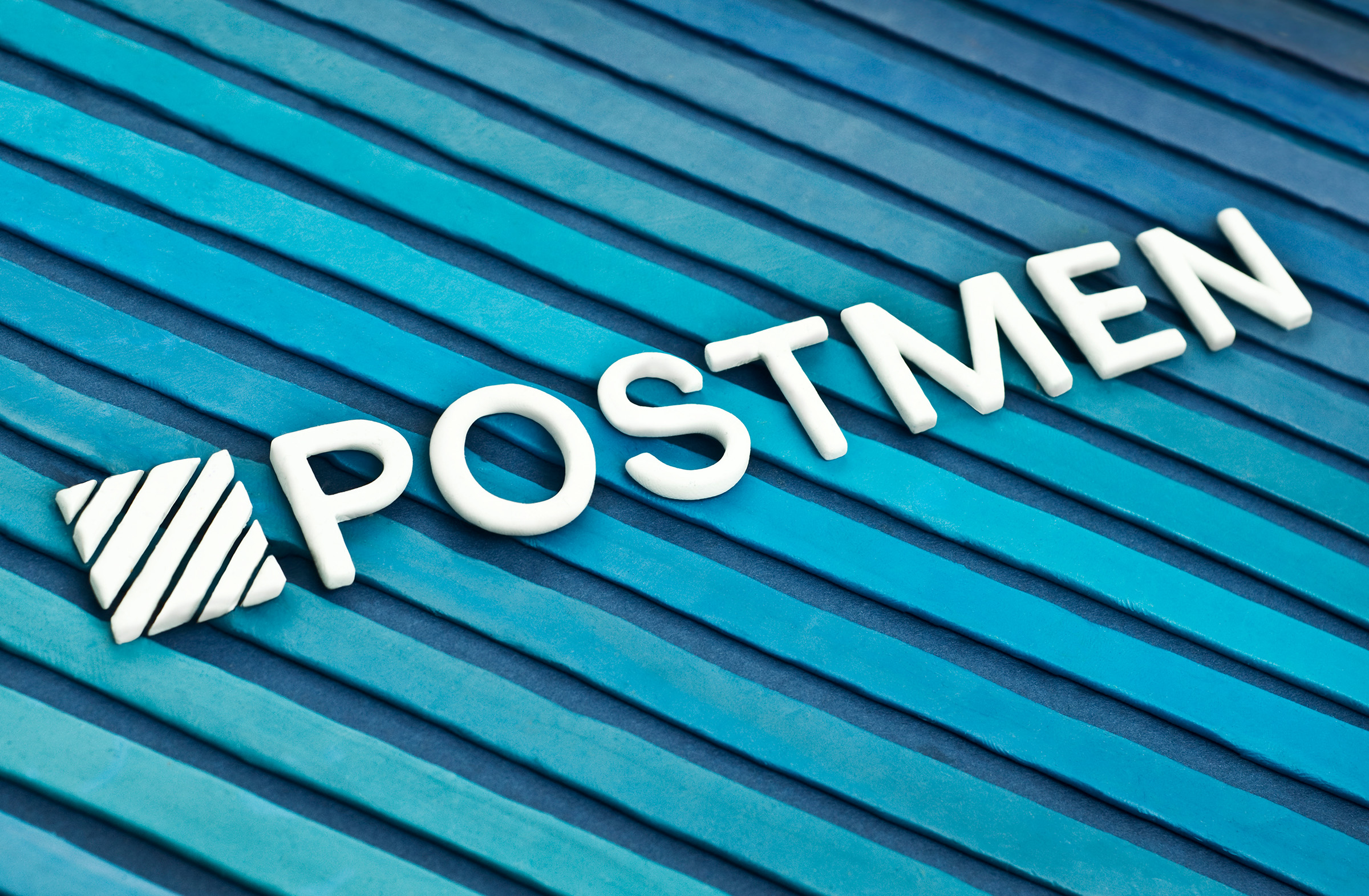
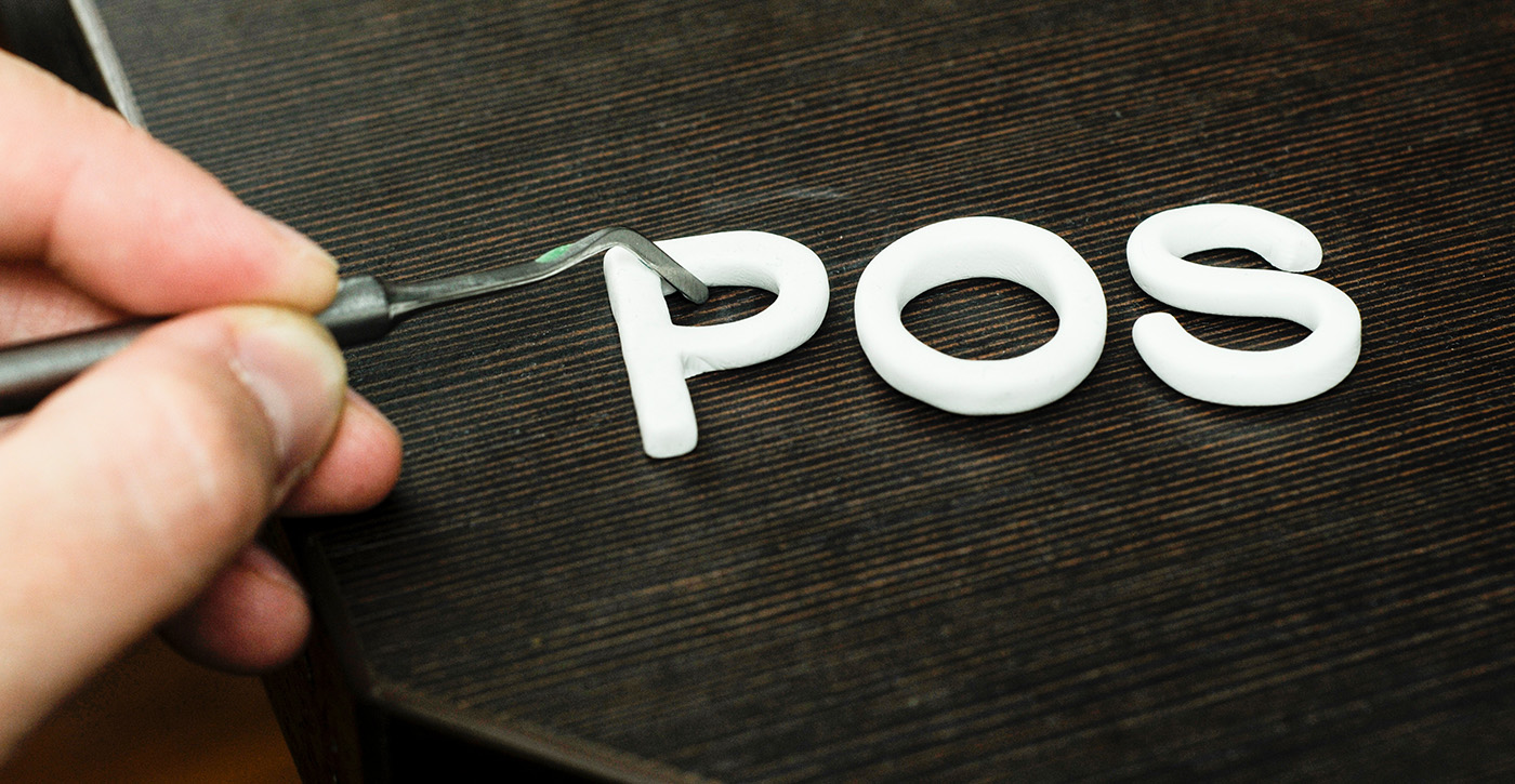
I created this work as part of a commissioned project for the creative agency Postmen, where the clay letters were originally intended to become part of a poster. I decided to photograph the letters separately as a composition, giving the logo an independent visual life.
The white lettering is actually made from white polymer clay. It was the better material for creating thin elements while keeping their shape under control.
I have worked with Postmen on four projects and have always enjoyed collaborating with their team. The art director for this project was Yaroslav Vedmid, founder of the agency.
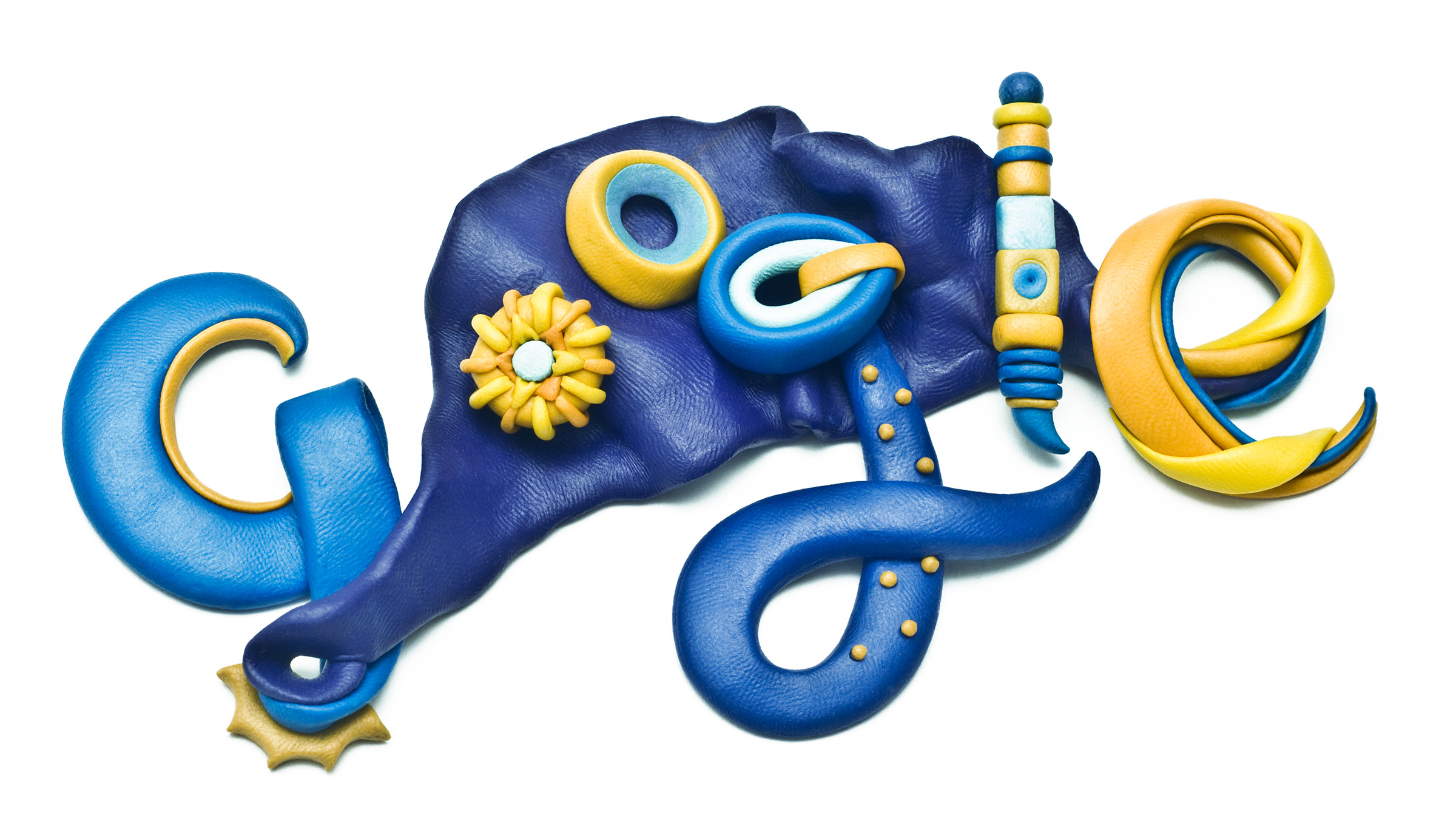
Google Doodle submission
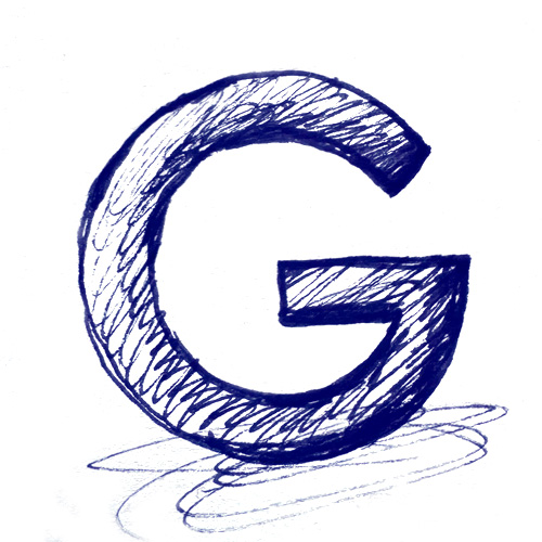
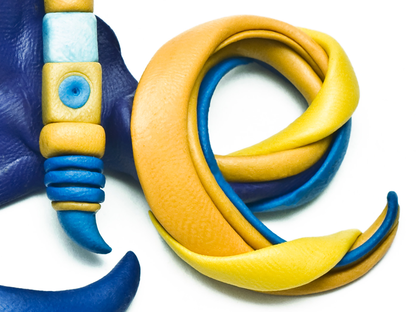
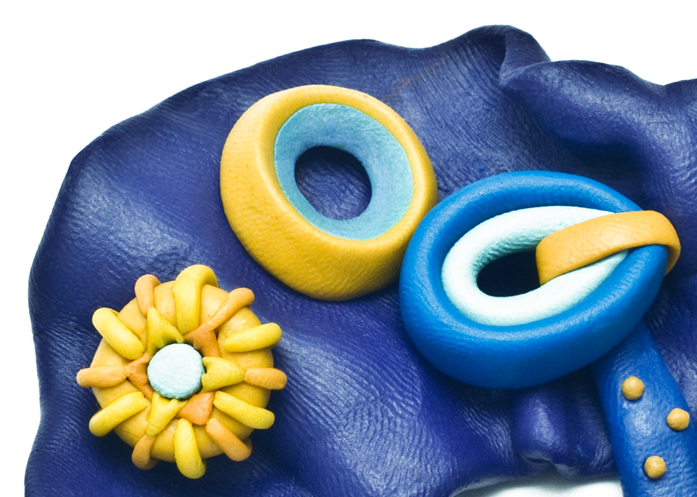
Challenge: Sculpting with just two colors
I have always loved Google's tradition of creating Doodles for significant dates and cultural events around the world. The company works with illustrators from many different backgrounds, and I have particularly enjoyed seeing artists create work celebrating Ukraine.
Inspired by this tradition, I created my own interpretation of what a Google Doodle for Ukrainian Independence Day might look like in clay.
This was a self-initiated submission, not a commissioned Google project.
ADC New York
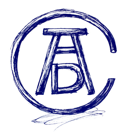
Challenge: Making a handmade object obey a precise logo
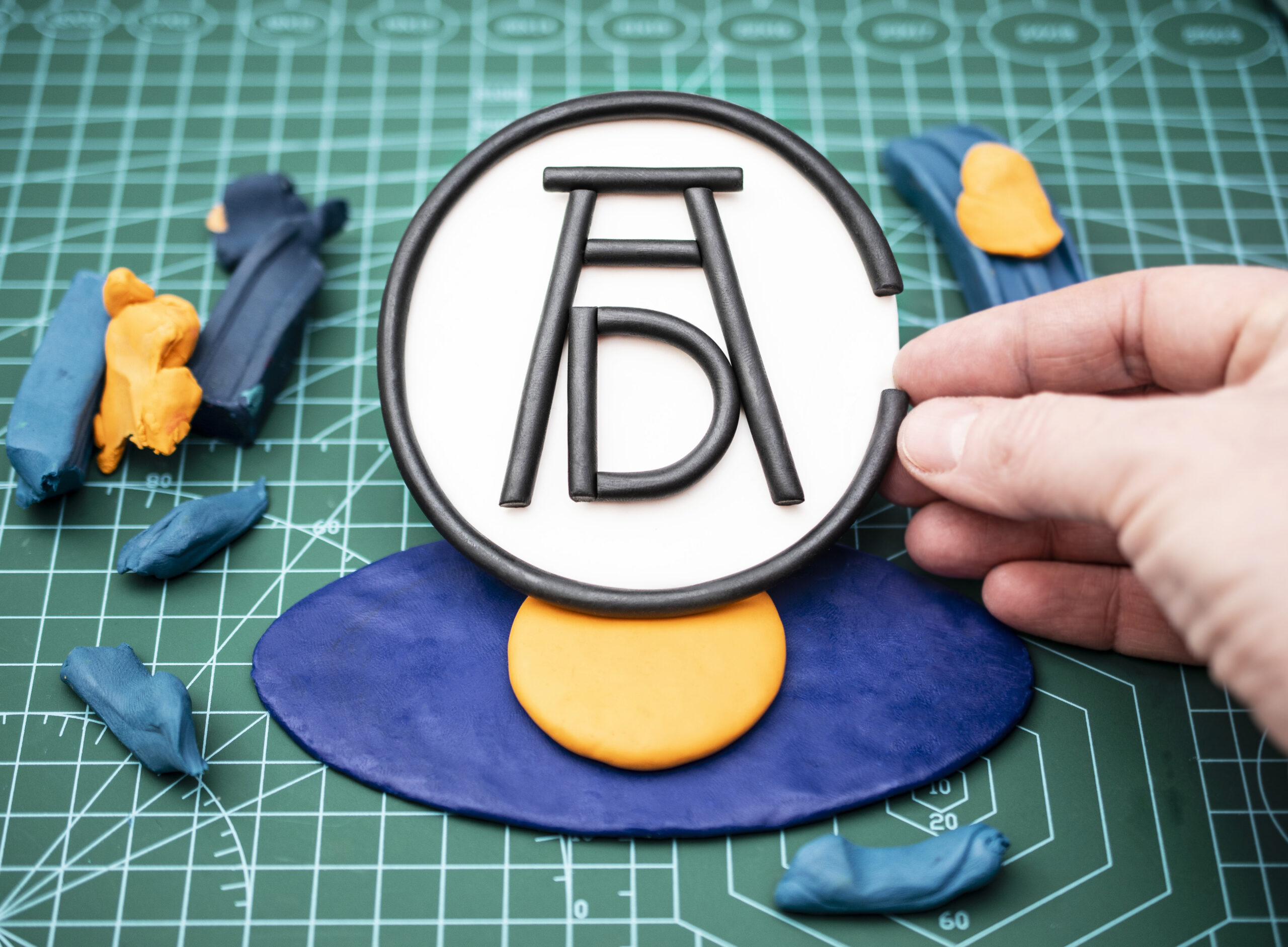
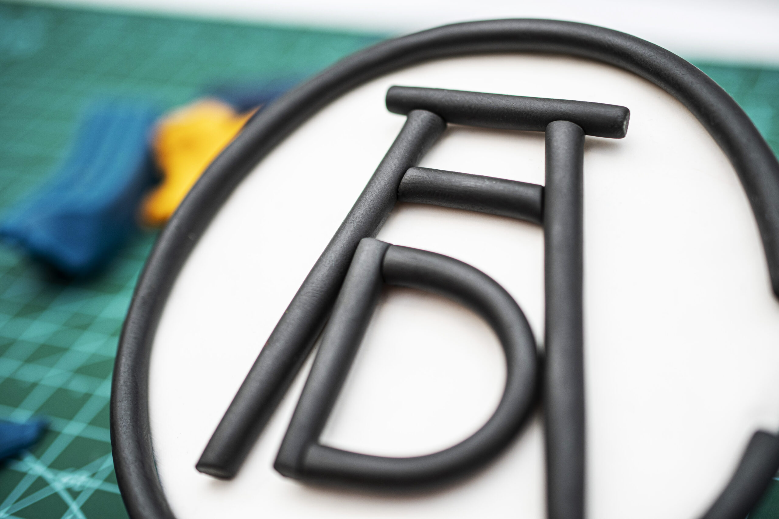
I created this interpretation of the ADC logo after being invited to serve on the ADC New York jury in the Illustration category in 2025.
The physical nature of clay became a metaphor for the collective effort behind creative achievement: many people contribute to making an award possible, while every winner has also built their success through their own work.
The main challenge was maintaining the exact proportions of the ADC logo while working with two very different materials: air-dry clay for the white section and wax-based plasticine for the black one.
Creative Practice
Challenge: Straight lines, marble texture
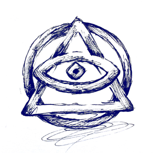
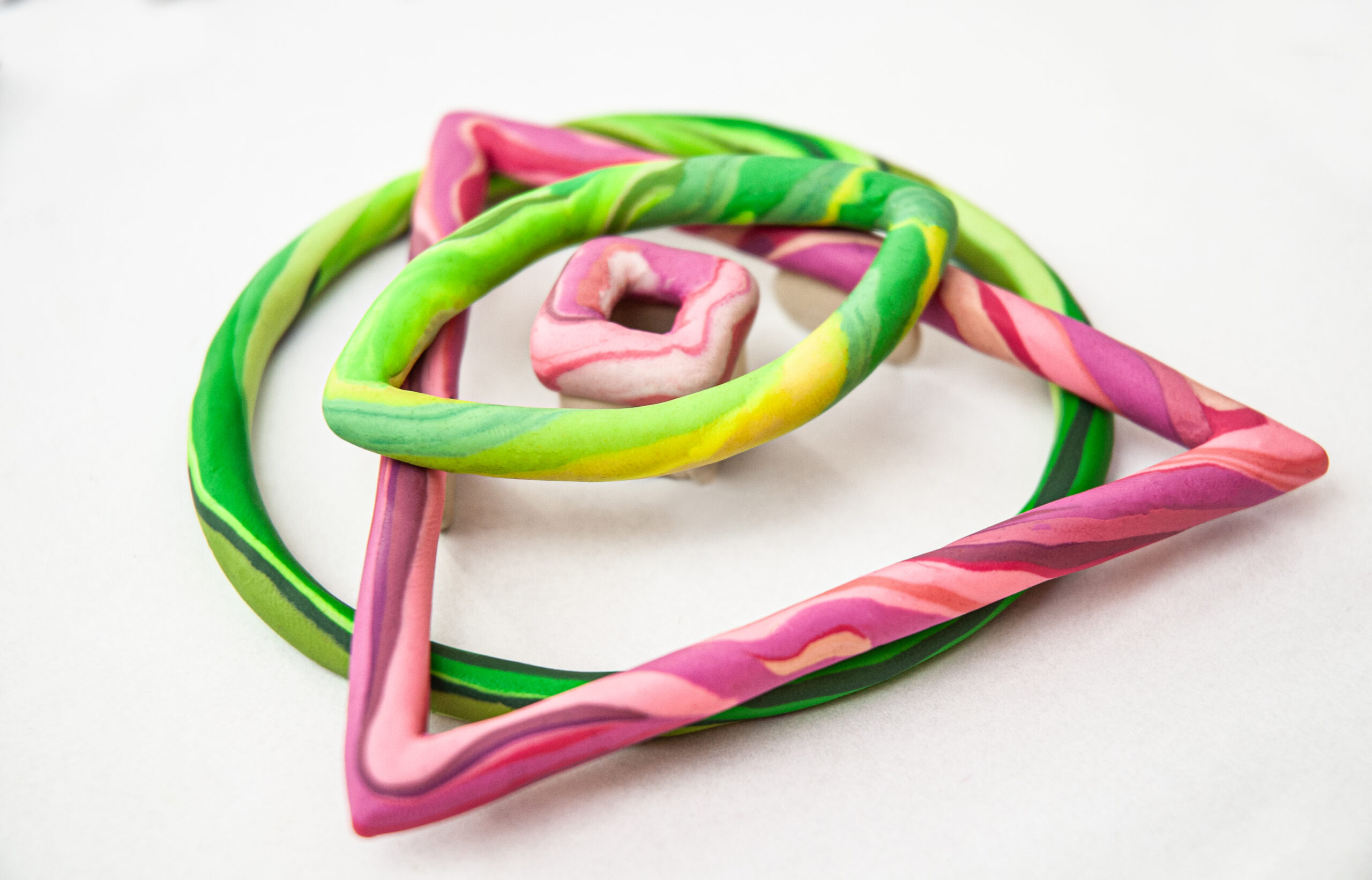
This work was commissioned by Anatolii Popel, CEO of Creative Practice and CASES.
Both platforms exist primarily in the digital space, but they are built around remarkably human and friendly interactions. That was the quality we wanted to bring into the physical interpretation of the logo — the warmth of connection and human interaction.
The challenge was maintaining the clean geometry of the logo while introducing flowing, marble-like textures into the clay.
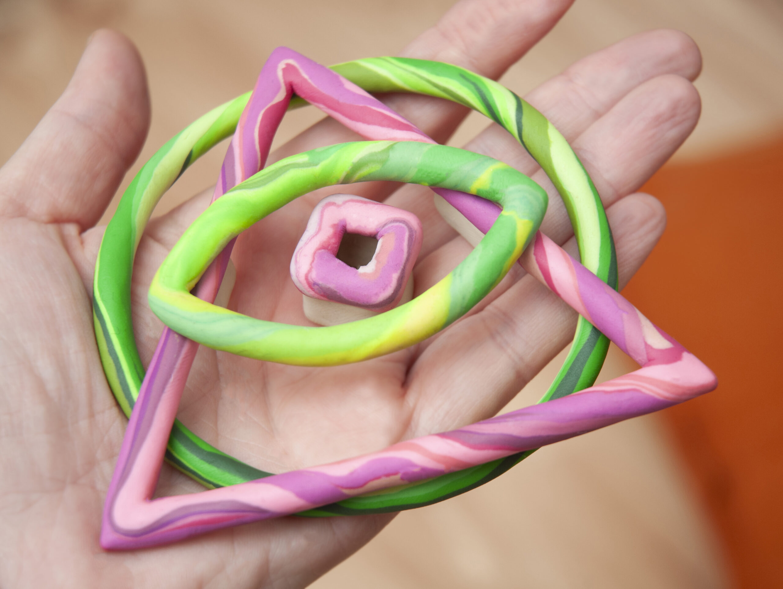
Challenge: How far can you move away from a logo and still keep its identity?
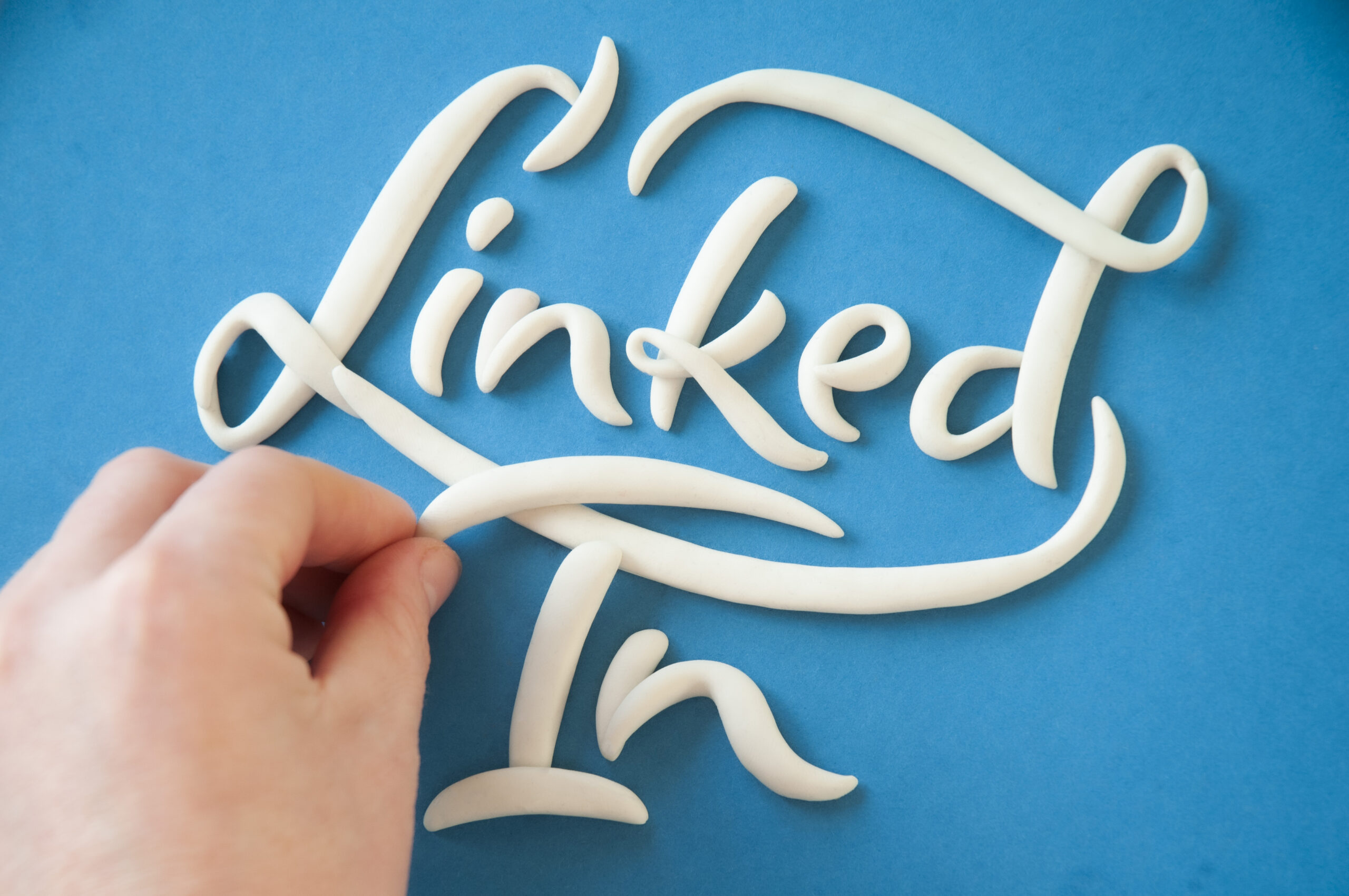
Unlike the other works in this collection, this is a free interpretation of the LinkedIn name rather than a direct recreation of its logo.
I respect LinkedIn as a platform for professional exchange and for the opportunity to learn from the experiences and insights of leading creatives.
For a social media post, I wanted to express that idea through the name itself — keeping the characteristic colours while transforming the word into expressive, calligraphic lettering.
I deliberately avoided reproducing the original logo shape, using only the name and its characteristic colour palette.
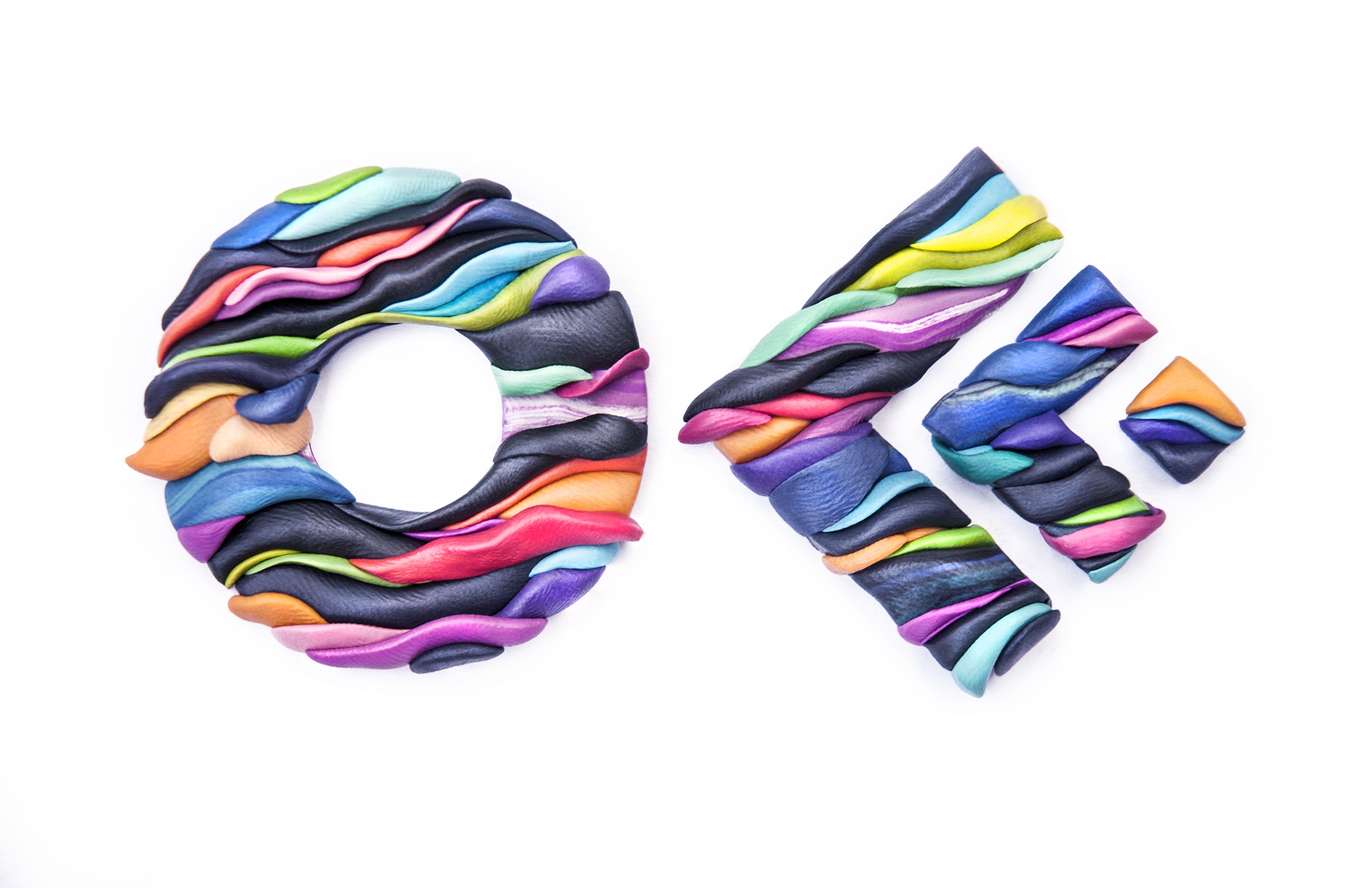
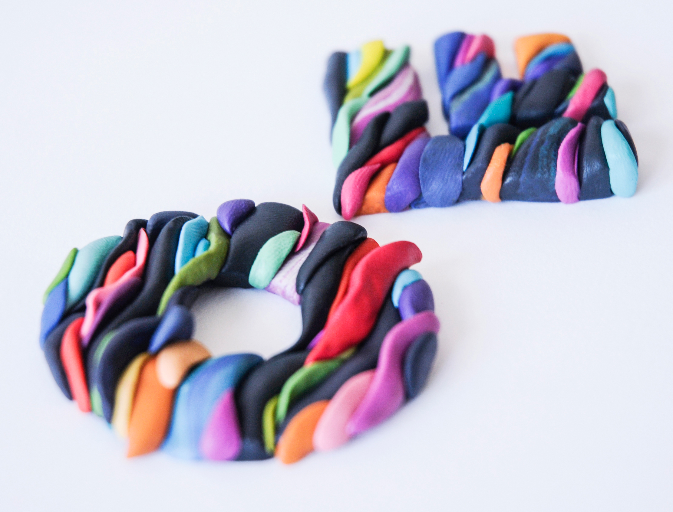
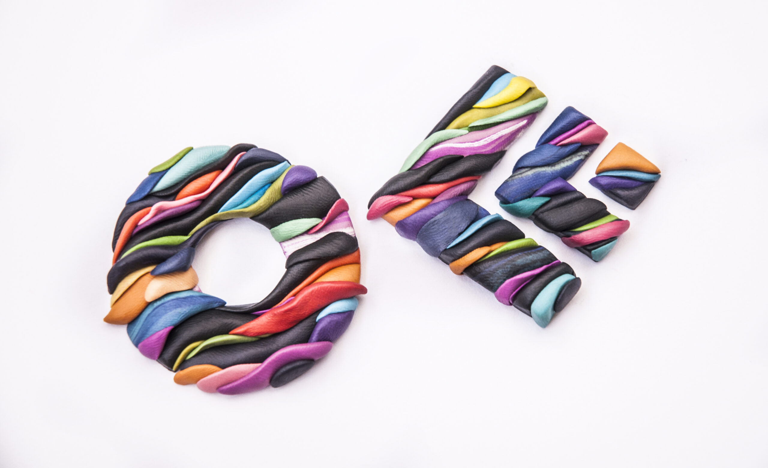
OFFF Kyiv
Challenge: How can something be restrained and colourful at the same time?
In 2019, OFFF Festival took place in Kyiv for the first time, and I was invited to lead a plasticine illustration workshop. To help promote the event, I created this interpretation of the festival's logo.
I was inspired by the diversity of the festival — as if it were made from many different parts, each with its own character, yet forming one coherent whole.
Thank you to Oleksandr Trehub and Misha Rybachuk for organising the event and inviting me to be part of it.
Thank you for watching the collection. If you have any questions, please contact me via hello@olhaprotasova.com
Selected Works
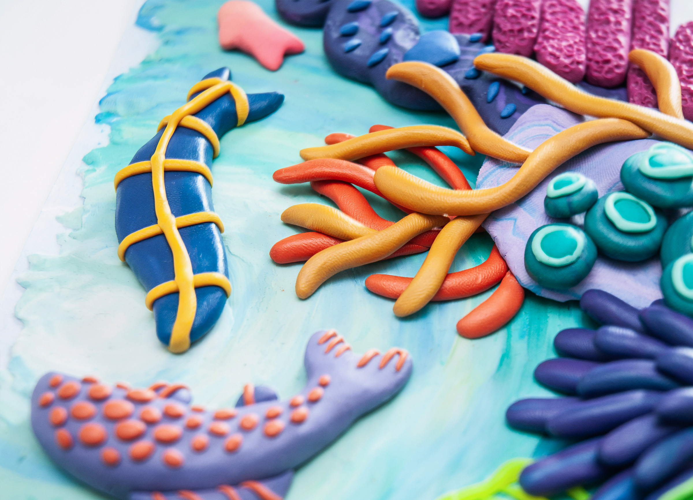
Tactile Sculptural Illustration & Lettering
Handcrafted visuals for brand campaigns and product storytelling
hello@olhaprotasova.com
© Olha Protasova. All rights reserved
 Behance
 Facebook
 Instagram
 Linkedin
 Pinterest
 Dribbble